🚀 6 new features
🏗 11 updates and improvements
🛠 7 bug fixes
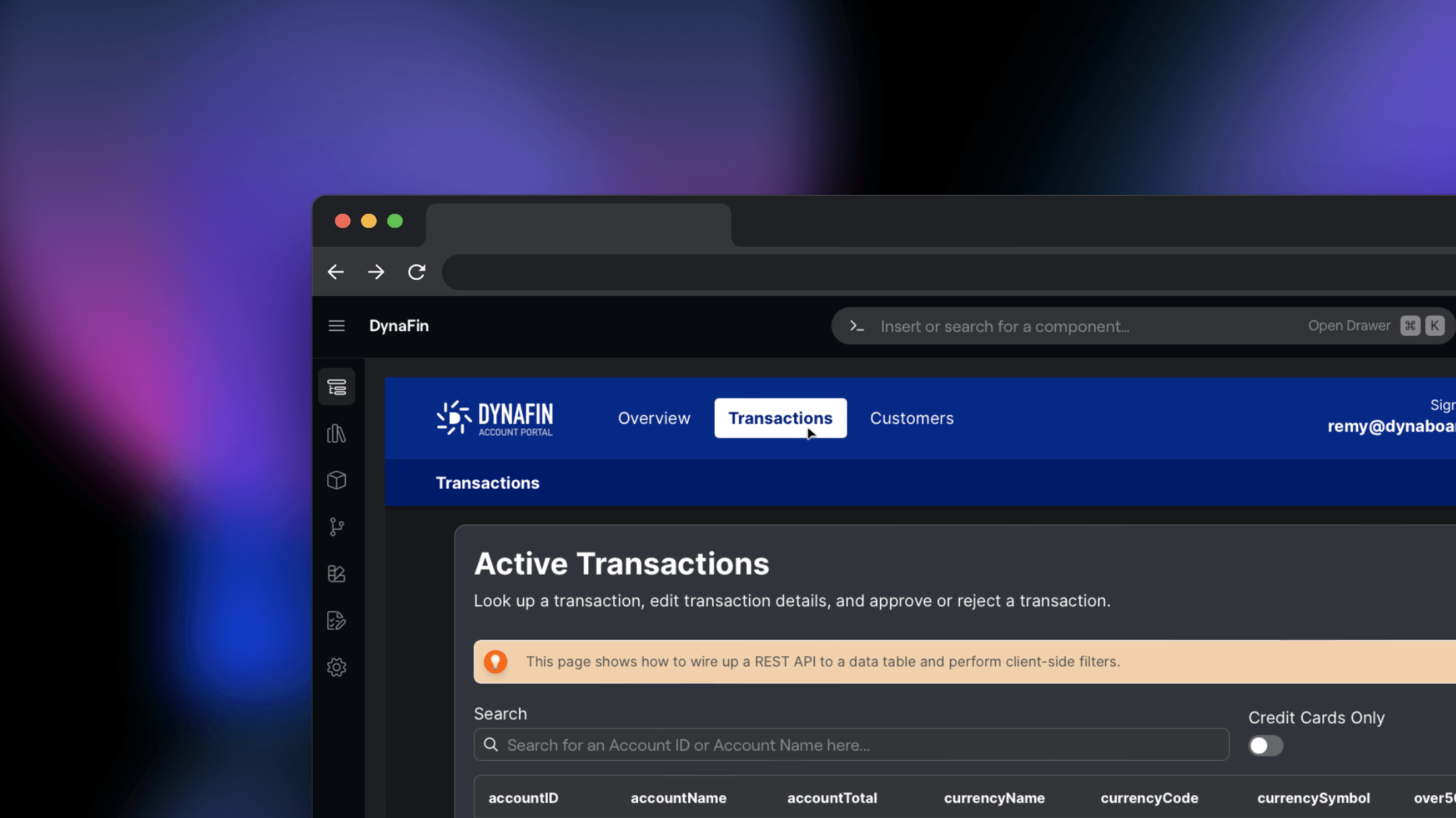
🚀 Navigation Bars
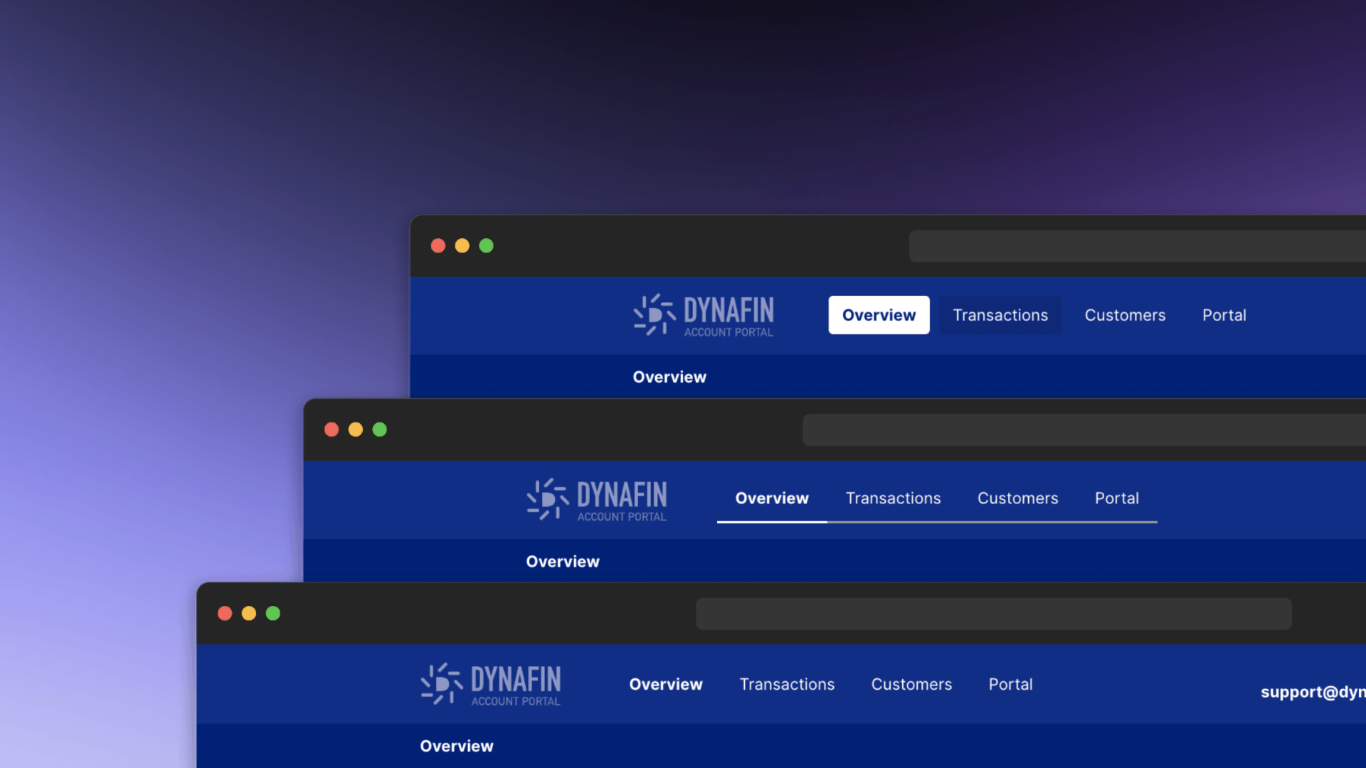
The navigation bar component automatically syncs with the pages in your application, offers 3 pre-built navigation item styles, and supports vertical / horizontal layouts.
🚀 Dialogs & Modals
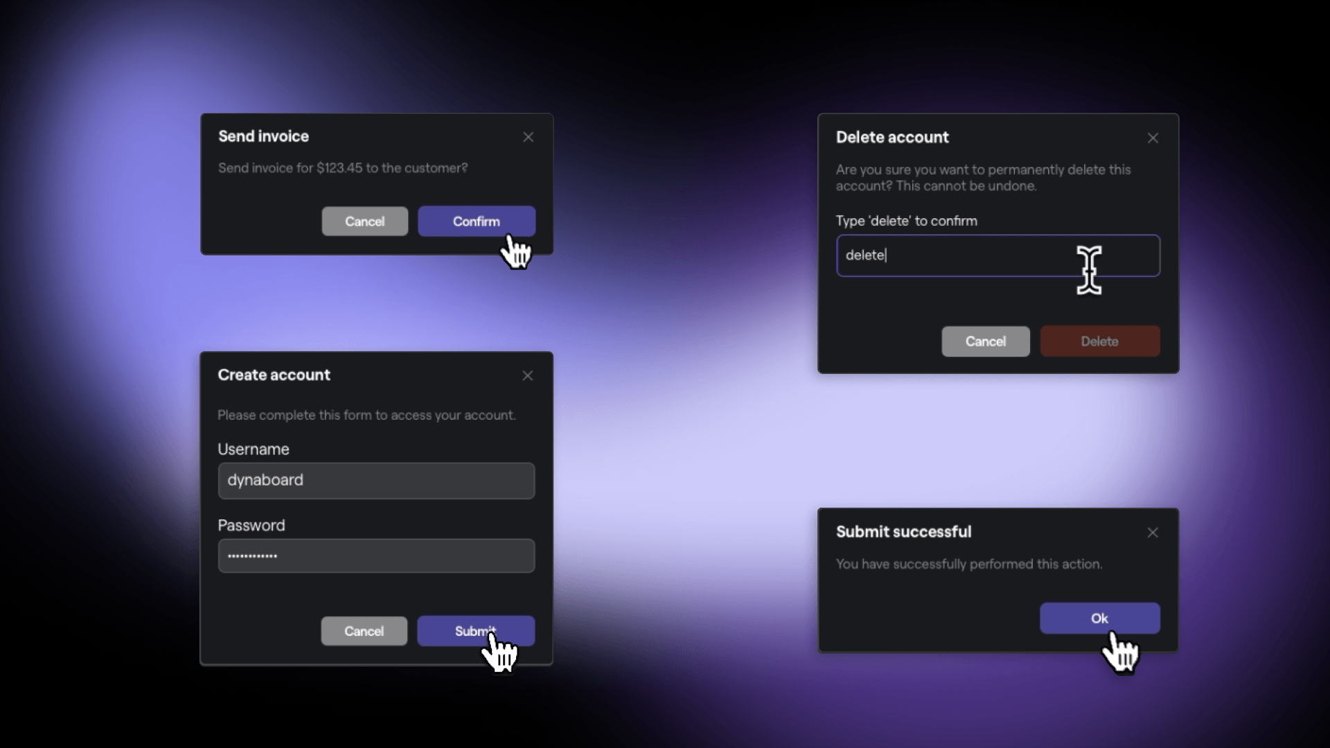
Dialogs offer four built-in presets, including: alert, confirmation, deletion, and edit. They can also be customized by either breaking out of an existing dialog component or creating a new one from scratch with the blank dialog.
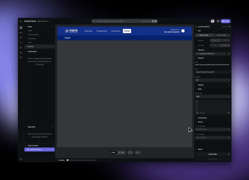
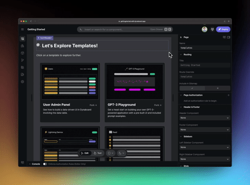
🚀 New Component Variants in Command Bar
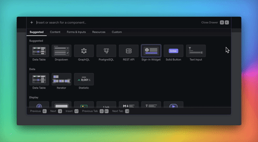
The Command Bar has new sections, the ability to seamlessly scroll between them without clicking, and more than a dozen new directly insertable node types including: page, image, video, audio, multiple chart types, email input, password input, configuration, secrets, and more!
🏗 Speed Improvements
We’ve made major strides in editor and deployed app performance when it comes to switching pages. In addition, page rendering speed when using an iterator or navigation bar has been cut by up to 60%!
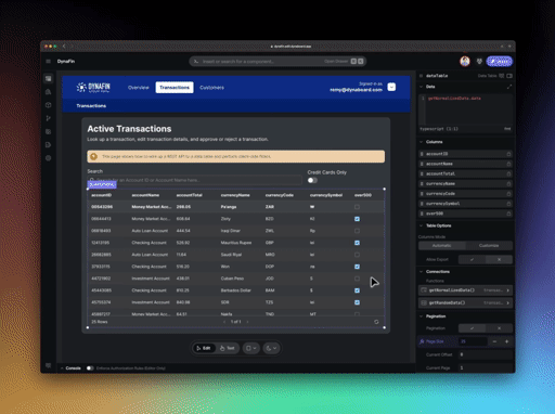
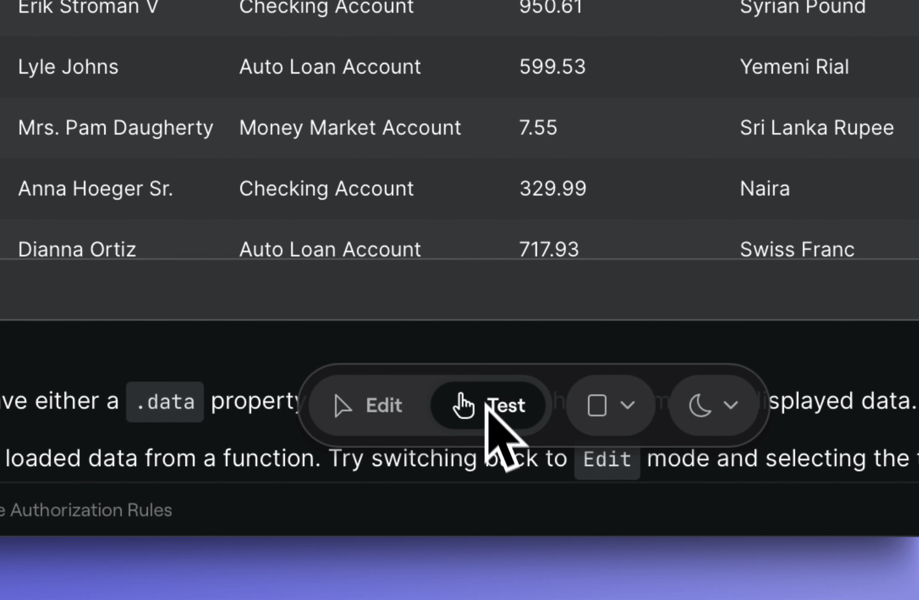
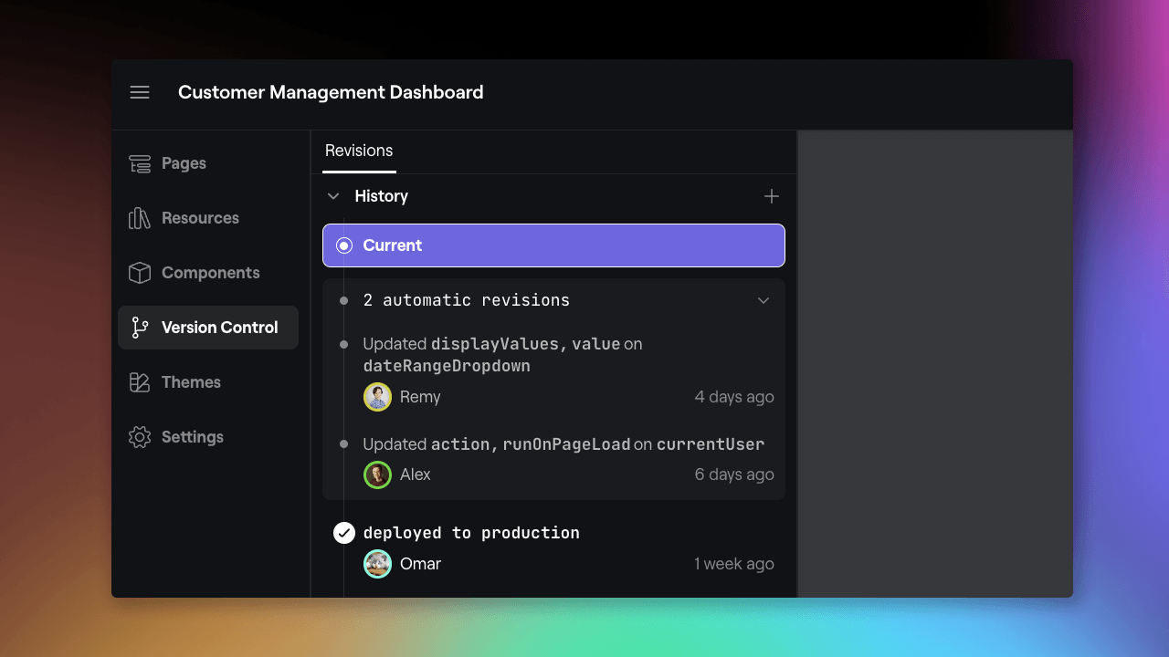
🏗 Locked & Unlocked Columns for Data Tables
We’ve made changes under the hood to custom column configuration in data tables. Locked mode ensures everything stays the way you expect no matter what happens to the underlying data, while unlocked mode adjusts the table to match any underlying data changes.
Editor
Text Editors
🏗 Quickly jump to the relevant node from docked property editors with the new “jump-to” action button.
🏗 Built-in $csv and $crypto libraries now have typeahead support in TypeScript Server functions.
🏗 Improvements to prioritization of components in typeahead to favor those on the selected page.
Command Bar
🏗 We’ve made improvements to the search functionality of command bar to surface more relevant results.
Resources
🏗 Improvements to the test connection default, success, and error states for all resources.
Firebase
🛠 Fixed an issue causing erroneous connection errors when connecting to Firebase Realtime Databases.
Components
🛠 Fixed issues with width / height sizing on certain UI components.
Feed
🚀 A new feed component has been added to allow for display of time ordered statuses or updates.
Data Table
🚀 Text, Number, and Image column types have been added to the data table.
🚀 A “chromeless” variant of the data table with configurable headers, footers, and striping is now available.
Custom Components
🏗 One-click breakout of pre-built components for navigation bars, dialogs, and more.
🏗 Jump to the underlying component in one click from any instance in the editor.
🛠 Fixed an issue that prevented function properties on a custom component from being overridden.
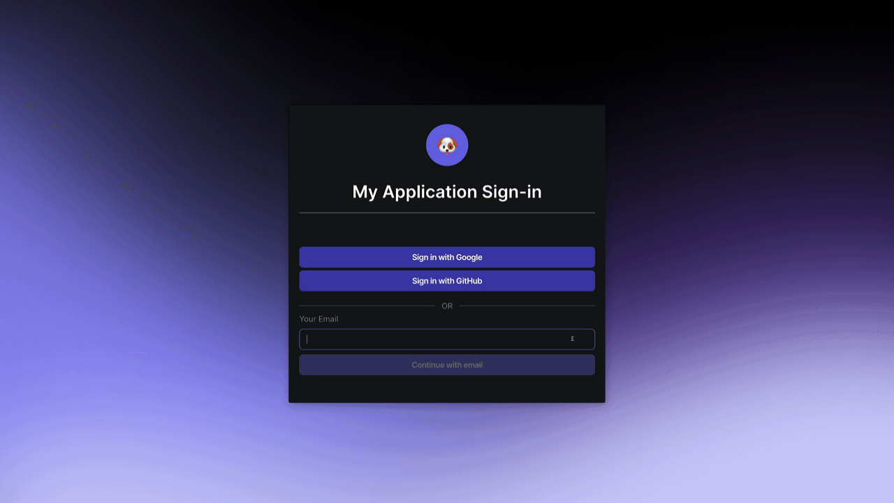
Sign-in Component
🏗 When inserting a sign-in component, a one-time PIN resource is created if no auth resource already exists.
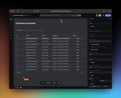
Pages
🏗 Improved page title placeholder auto-naming for better defaults in navigation bars.
Dialog
🛠 Fixed an issue causing Dialogs to not be centered in the viewport in a few specific circumstances.
Text
🛠 Fixed an issue where custom styles were not being properly applied to text nodes.
Image
🛠 Fixed an issue where custom styles were not being properly applied to image nodes.
Documentation
🛠 Updated broken links in the PostgreSQL and MongoDB configuration documentation.