🚀 3 new features
🏗 17 updates and improvements
🛠 20 bug fixes
Build faster with the new Command Bar
🚀 We’re just getting started with improvements to the way you insert and find UI components, resources, and functions to your application. Start browsing available UI components or search for any existing nodes by clicking the command bar at the top of the editor or using the
CMD / CTRL + Khotkey. Expect a lot more improvements coming soon ✨
Use the editor with smaller screens and windows
🚀 We’ve completely overhauled how we display panels in the editor. In order to support smaller screens and windows, we’ve added the ability to collapse both the left and right panels as well as a new hover systems to support quicker navigation between different tabs and nodes.
Create advanced custom components easier with the new property definition system
🚀 We’ve made it easier to define custom component properties in the UI. Using the new properties panel on components, create a property, provide a display name, and define the type. Properties passed to components can be numbers, strings, objects, colors, or even functions!
Editor Updates
🏗 When hovering a cursor over UI Components, the component name, outline, and corresponding item in the component tree are now automatically shown and highlighted.
🏗 All panels now display the number of nodes (components, resources, functions, etc..) when collapsed.
🏗 Components with children (e.g. containers) are now expanded by default.
🏗 Added “jump to” buttons on all function selectors with a selected function.
🏗 Create functions directly from resources using the new functions panels. The new functions panel also takes the place of the original functions tab showing all functions connected to the selected resource.
🛠 Updated the canvas cursor icon for consistency with multiplayer editor experience.
🛠 Property labels are now fully clickable in the right side panel rather than just the property field.
🛠 Fixed issue where changing pages in the editor caused a scroll to the top rather than preserving scroll depth.
🛠 Toast notifications have been moved above the new floating action bar at the bottom of the editor canvas.
🛠 Fixed an issue causing there to be no active component or resource selection after using an undo action.
Text Editors
🛠 Page state variables are now shown as assignable values in code editors.
🛠 Fixed an issue causing an errant semi-colon to be placed in front of an array when auto formatting.
🛠 Autocomplete suggestions now support selection via a mouse cursor.
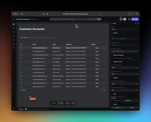
UI Components
Pages & Containers
🏗 Components placed into a page or container while in stack mode are now given 100% width or height in the opposite direction of the stacking context.
🏗 We’ve improved the severed Open Graph data for individual pages in deployed apps.
🛠 Grid and stack modes have been improved with stability enhancements when switching between modes.
🛠 Invisible UI components are now collapsed to take up no space. This leads to proper stack mode behavior with hidden UI components.
Inputs
🏗 Multiple improvements to input labels with new percentage widths, text alignment, and the default label values.
🏗 The dropdown default value selector is now a dropdown itself.
🏗 Left and right input accessory icons and labels now support their own on-click handlers.
🛠 Fixed the dropdown’s default font weight adjusting it to normal vs medium.
🛠 The dropdown no longer has default display values set that caused confusion when updating the underlying values.
Custom Components
🛠 Theme tokens are now properly supported in the background color of custom components.
Sign-In
🛠 Fixed an issue that caused the sign-in node to error in the editor when the browser window had been left open for extended periods of time.
🛠 Fixed an issue where a previous sign-in error wasn’t cleared when using the one-time PIN resource.
🛠 The PIN code UI now properly scales down on a mobile screen size.
Charts
🛠 Charts now have a default background color set.
Themes & Styling
🏗 The use of
surfacecolors for UI components (e.g.surface.100, surface.200, etc...has been deprecated in favor ofbackgroundusingbackground.base, background.levelOne, background.levelTwo, background.levelThreefor color levels. This was done to improve styling consistency in apps across dark mode and light mode.🏗 A new
dynaboardGraycolor is now supported with color levels.50, .100, .200, ..., .900.
All Components
🏗
<componentName>.childrenreturns an array of the children of the referenced component.🏗
$parentis a new global which resolves to the parent of the current component.
Resources & Functions
Configuration & Secrets
🏗 Numbers are now supported as a defined configuration type.
🏗 Secret configuration now supports a visible fallback if no secret is provided.
Postgres Resource
🏗 Common connection error messages have been improved for faster configuration.
OpenAPI Resource
🛠 Fixed an issue where headers and query params were not being appropriately passed in OpenAPI resource functions.
MySQL Resource
🛠 Multiple distinct SQL statements are now correctly supported.
All Functions
🛠 Fixed an issue with functions where using both client-side
{{ }}and server-side${{ }}interpolation in the same function caused an error.