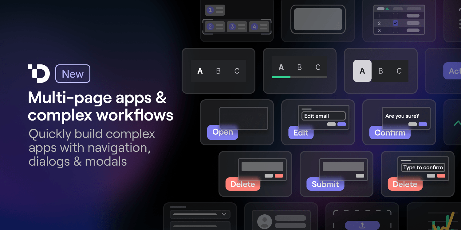
As users have broadened the scope of apps built in Dynaboard, they’ve faced two major problems: implementing multi-page navigation & building complex multi-step workflows. While it has been possible to implement partial solutions, we’re making things much simpler with two new components:
A Navigation Bar with built-in current user, authorization, and page awareness
Dialogs & modals that are completely customizable and programmable
Tackling complexity with composable UI
We built Dynaboard from the ground up with composition as a first-class feature. UI components in the Dynaboard editor come in three main types:
Base Components: make up the base atoms (inputs, text, buttons, images, etc…) of UIs in Dynaboard. They can be customized, but they cannot contain other components.
Custom Components: are built visually within the Dynaboard editor. Each custom component contains its own state, data fetching logic, and custom behaviors.
Higher Order Components: exist as wrappers to extend custom components with new functionality and display one, or more than one, at a time.
The composition of base components into custom components, and custom components into higher-order components, enables quick development of more complex apps.
For example, the Iterator — our original higher-order component — behaves as a visual “for loop,” taking an array of JSON objects and a custom component as inputs. Each JSON object is then passed into a custom component where it provides a list of properties, which can be almost anything including: strings, objects, and even functions!
Depending on how the Iterator is used, it can become: a list, a table, a group of cards, a tag cloud, or anything you need it to be to display an array of data.
While the Iterator and custom components are able to handle a many complex UI / UX tasks, we knew things could be easier for larger applications.
Navigation Bar — Going multi-page and multi-purpose with your apps
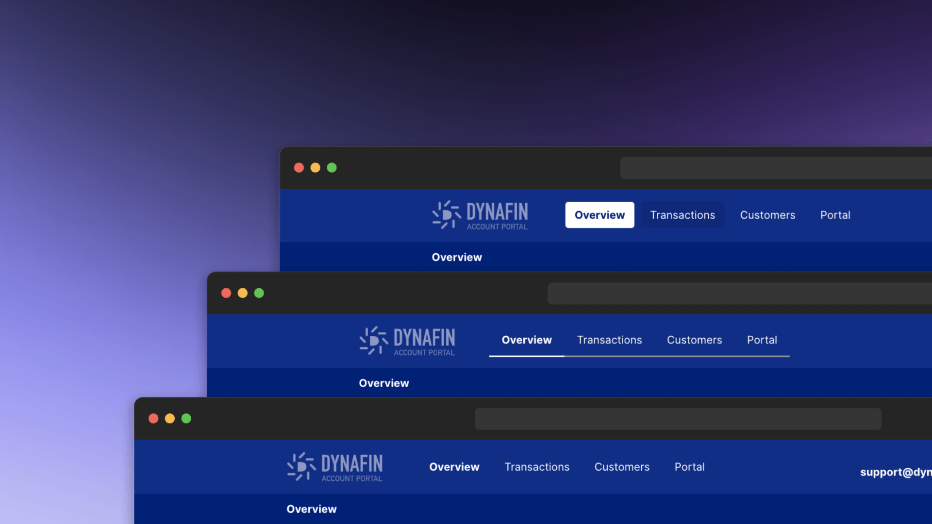
The first of our new higher-order components is the Navigation Bar, and under the hood, it behaves more or less like a variation on the Iterator. However, we’ve given it more information about the current page, current user, and applicable authentication rules, so it can take that information — along with the list of pages — to appropriately render each individual navigation item custom component. When you use a navigation bar in your project you can:
Choose from pre-built button, tab, or link types for navigation items
Support uncommon use cases with custom components
Ensure consistent styling with built-in theme support
Build complex multi-page UIs by combining navigation bars with headers
Dialogs — Supporting complex workflows with custom components
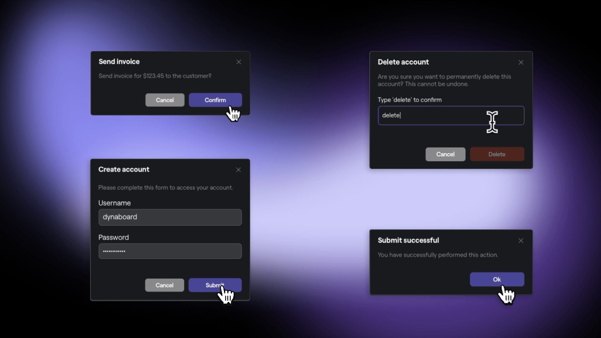
Like Navigation Bars and Iterators, Dialogs take a component and pass it a set of properties. However, dialogs only render a single custom component comprising any defined inputs, text, or functionality.
Just like in popular libraries for your favorite front-end framework, in Dynaboard, functions from your page can be passed into the dialog as a callback. Dialogs are opened and closed using functions attached to the built-in Browser resource, and they can also be inserted from the command bar where you're able to then:
Choose from 4 dialog presets including: alert, confirmation, deletion & edit
Build your own dialog with custom components and the blank dialog variant
Add callbacks to update a DB, make an API call, or modify UI on dialog close
Build your next app in Dynaboard
With higher-order components like the Navigation Bar and Dialog, we’re bringing the full power of a low-code IDE to developers to accelerate building large and complex applications, not just simple ones.
Have a complex app internal tool or customer facing app in mind that you’d like to build? Get started — and maybe even finish — today! Sign up to try out Dynaboard for free, and check out our documentation site to get started with recipes, templates, and references.